belly_button_biodiversity
https://ladyj-dev.github.io/belly_button_biodiversity/

The goal of this assignment is to build an interactive dashboard to explore the Belly Button Biodiversity dataset, which catalogs the microbes that colonize human navels.
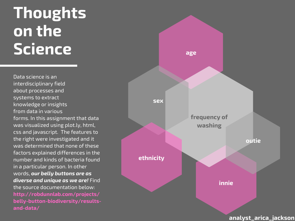
The dataset reveals that a small handful of microbial species (also called operational taxonomic units, or OTUs, in the study) were present in more than 70% of people, while the rest were relatively rare. If you get a chance, check out the source documentation, it’s very interesting!
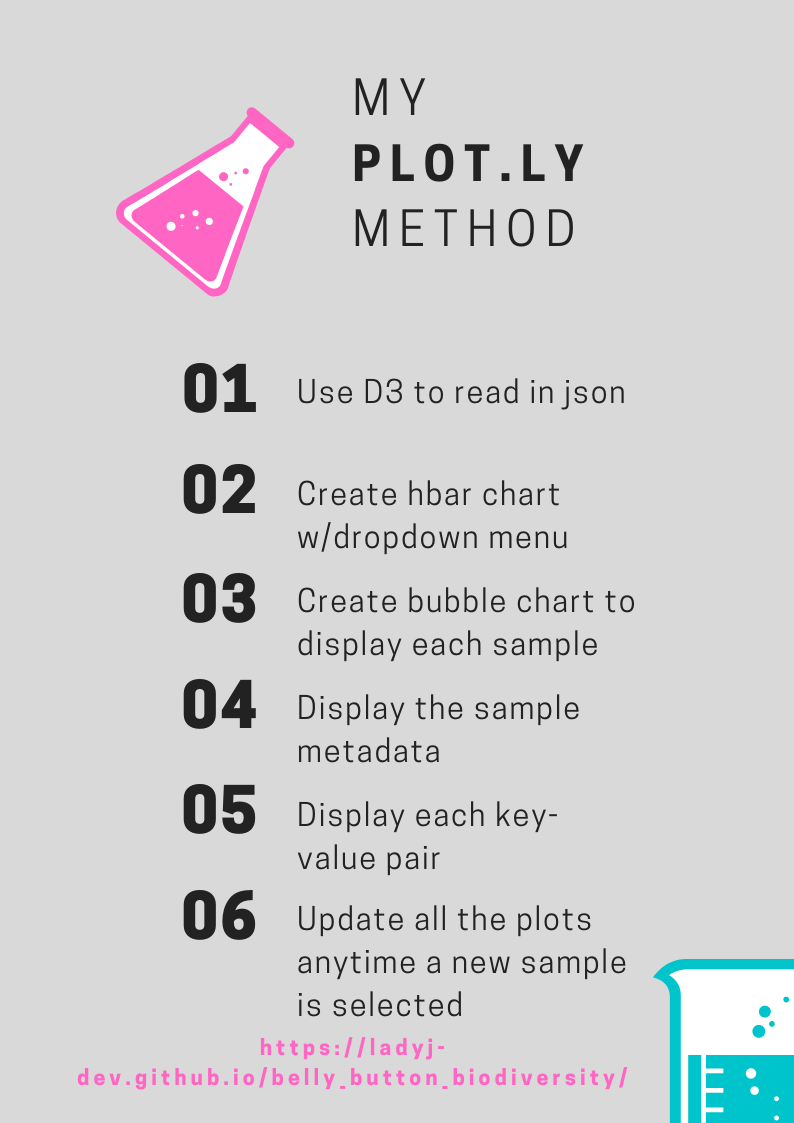
Step 1: Plotly
-
Use the D3 library to read in
samples.json. -
Create a horizontal bar chart with a dropdown menu to display the top 10 OTUs found in that individual.
-
Use
sample_valuesas the values for the bar chart. -
Use
otu_idsas the labels for the bar chart. -
Use
otu_labelsas the hovertext for the chart.
- Create a bubble chart that displays each sample.
-
Use
otu_idsfor the x values. -
Use
sample_valuesfor the y values. -
Use
sample_valuesfor the marker size. -
Use
otu_idsfor the marker colors. -
Use
otu_labelsfor the text values.
-
Display the sample metadata, i.e., an individual’s demographic information.
-
Display each key-value pair from the metadata JSON object somewhere on the page.
-
Update all of the plots any time that a new sample is selected.
*Create any layout that you would like for your dashboard.
Deployment
-
Deploy your app to GitHub Pages. Submit the links to your deployment and your GitHub repo.
-
Ensure your repository has regular commits (i.e. 20+ commits) and a thorough README.md file
Hints
-
Use
console.loginside of your JavaScript code to see what your data looks like at each step. -
Refer to the Plotly.js documentation when building the plots.
About the Data
Hulcr, J. et al.(2012) A Jungle in There: Bacteria in Belly Buttons are Highly Diverse, but Predictable. Retrieved from: http://robdunnlab.com/projects/belly-button-biodiversity/results-and-data/